


You might have noticed, a thing or two has changed at Userbrain. Things are looking a lot fresher and snazzier. And quite frankly, we’re ecstatic to be able to finally share this brand-new look with you.
At the same time, we know that things might look completely different from when you last paid us a visit. So whether you’re a Userbrain lover or tester — here’s a breakdown of why we decided to give Userbrain a visual revamp; what has changed (and what hasn’t) as well as what exciting things you can expect in the upcoming months.
Start testing in minutes and get results within hours. Tap into our pool of 170k+ testers and watch videos of users interacting with your product on their devices. Discover what’s working for your product, and what’s not!
Start your free trialWhy we chose to give Userbrain a visual revamp
Userbrain has been ten years+ in the making and has seen incredible successes along the way. What started as an idea for a user testing tool to cover our UX consulting clients’ needs became a new venture.
A simple, easy, and affordable user testing tool that has grown and grown over the years. A way of user testing that is now serving UX teams across big brands like Spotify, Red Bull, and Porsche, helping them build products people love to use. Just like our user and tester base has grown and evolved throughout the years — this year, we knew it was time for a change (and after all, we’ve gotta keep up with the cool kids, right?).
The result: a visual revamp that we’ve developed, tweaked, and tested over months on end to uplevel your Userbrain experience and bring user testing to even more people.
Introducing: the new, fresh, and snazzy Userbrain
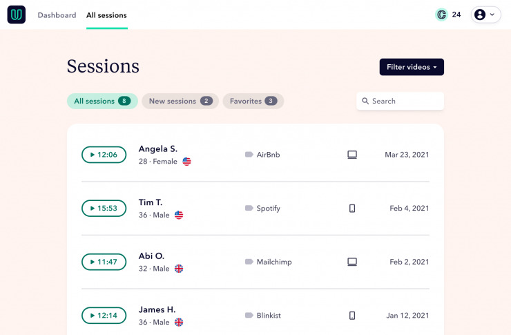
The biggest change you probably already noticed is Userbrain’s look and feel. We’ve updated everything from the logo to the dashboard and tightened up our tone and style throughout. Let’s walk you through it:
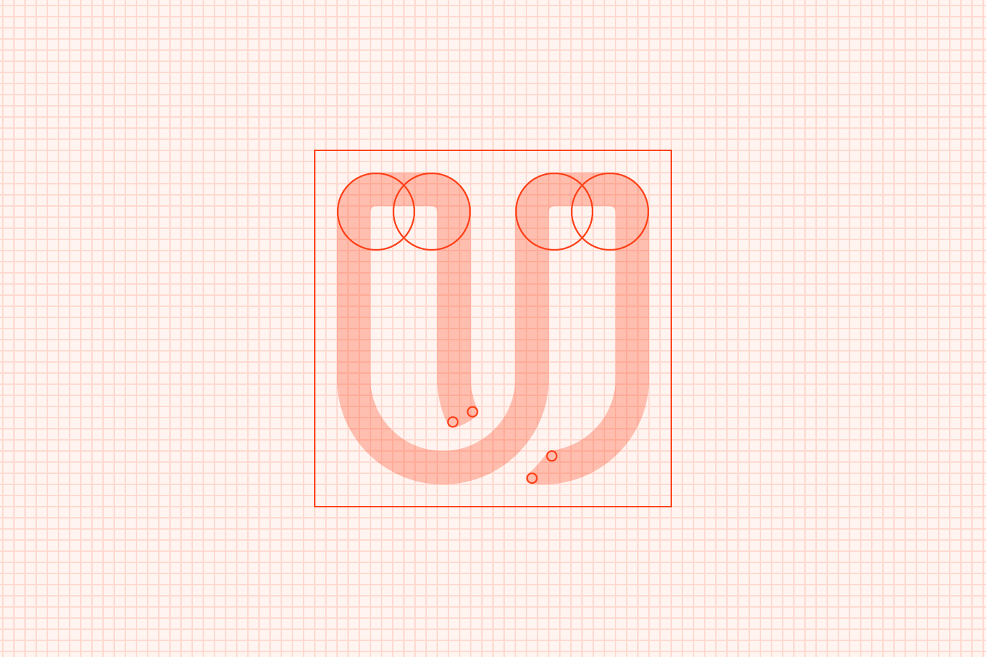
The logo
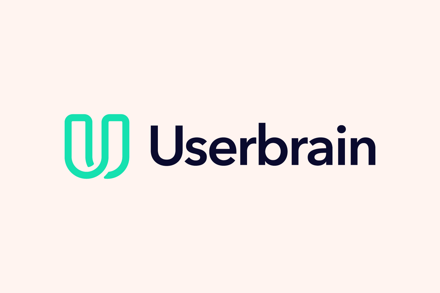
When it came to creating a new Userbrain logo, we wanted to keep certain elements of our previous branding. Things like its simplicity, the connection of colors and layout — we knew they had worked well for us in the past, which is why we kept them consistent.
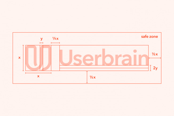
The colors

The green and blue elements were used as the baseline — yet moving into a bolder, more contrasting approach reflecting a fresh and 2021 style.
The app icon
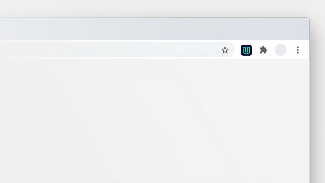
The app icon is incredibly important to us; it’s what helps you find Userbrain in your app store or extensions. And although our previous one was simple and unique, it had little to no connection to our name or what we stand for. So after many brainstorming sessions, mock-ups, and user test runs, we ended up with this one — a minimal yet unique app icon whose color and style stand out from the crowd while enveloping the simplicity of Userbrain.
The typography
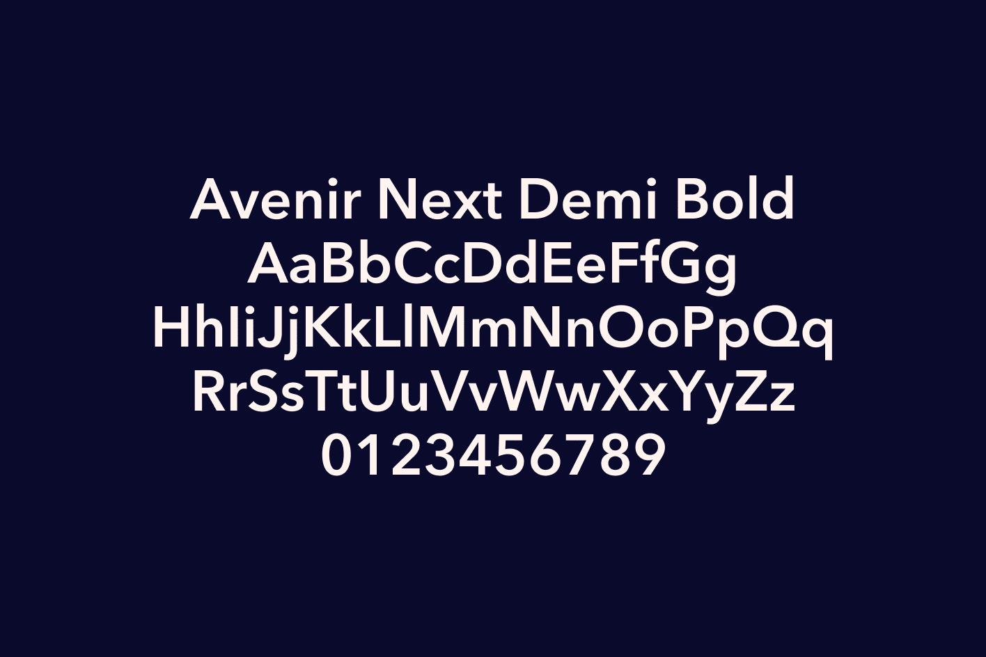
The corporate typeface is Avenir Next from Linotype which is an improved version of Avenir, originally designed by Adrian Frutiger in 1988.
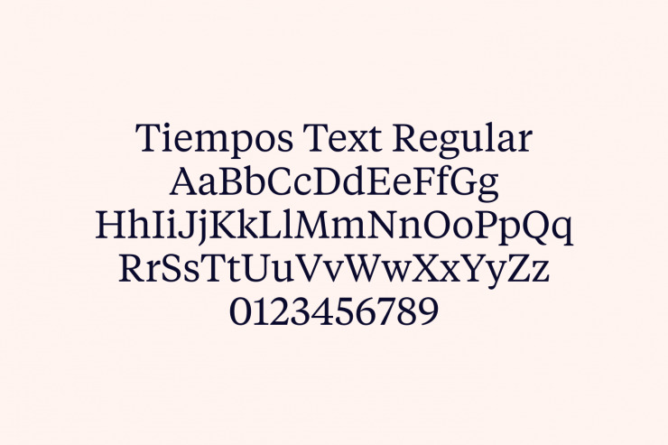
In addition to Avenir Next, Tiempos Text (Klim Type) can be used for headlines and accents.
Copy, tone, and style
If you didn’t know yet, you know now: copy plays a huge role in UX, and with brands like Slack leading the way — we’ve also decided to tighten things up when it comes to our tone and style.
We’re leaning into a way of writing that:
- Keeps things simple and to the point
- Avoids jargon and buzzwords (as much as we can, but we are UX peeps after all)
- Feels more like a conversation
- Keeps wording and descriptions consistent
- Keeps you entertained and reading (we’re probably doing ok if you got this far ;))
Btw this might also be a good time to point out that, although we know you all love experimenting, please do your best to refrain from spelling us as UserBrain or USERBRAIN; it’s Userbrain. Trust us; we had a workshop about it. It’s on a Notion board in an official Userbrain Tone & Style Guide; this is it.
Why? You ask. Because keeping the ‘U’ capitalized draws attention to our brand/helps highlight it in a sling of copy, while not screaming at you (looking at you USERBRAIN spellers), or going the outdated route aka. (yup, that’s you, UserBrain typers). This way of spelling also aligns with our brand-new logo, giving an overall more slick feel.
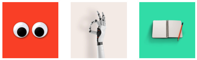
Photography
For communicating basic benefits and features of Userbrain, use isolated still life photography on backgrounds in the Userbrain brand colors.
Visually, we’ve done a 180° — but in the backend, we’re still the same
Sure we look entirely different, but you’re probably happy to hear that we’ve kept the backend and core functions of Userbrain the same.
Why? Cause you don’t fix what’s not broken — right?
We’ve been testing and tweaking our features for many years now. We know what you love (and hate), and although we’ve adjusted the fonts and colors in the backend, the features and functionalities of Userbrain will stay the same. For now, at least.
You can, however, expect some improvements in the next few months, which we’ll rigorously test before release. Want in on the action? Sign up here to help us improve Userbrain’s UX.
What’s next?
Along with some great UX & UI improvements, we have some fantastic resources lined up to help you get started and make improving your user testing skills even easier. We’re talking examples, templates, downloads, and more. So keep an eye on our blog, or (if you haven’t already) sign up for our newsletter, and we’ll keep you posted.
Got feedback?
We hope you’re loving the new, fresh, and snazzy Userbrain just as much as we are, but being the nosy and curious bunch we are — we’d love to hear your thoughts and feedback. Drop us a line at support@userbrain.com and let us know what you think.