


Web users are constantly being pulled in all directions. You need to make sure that your site is answering all their burning questions and engaging with them on multiple levels. You’ll need to engage their hearts and their minds before you get anywhere close to their purses.
Here are some key things that users will want to ask from you – make sure that you’re offering them a well-rounded experience that goes beyond usability to brand advocacy and loyalty.
Do you guys really care?
It’s easy for brands to pay lip service to corporate social responsibility and write glossy mission statement pages about how much they care about the local community and how they are going to save baby gorillas – but people’s BS sensors these days are pretty sensitive.
Your brand will need to make a genuine commitment to users and customers: make sure that you stand behind your claims and that you make a real effort.
- One great way to start is with a solid commitment to usability and customer experience. You want your website to be accessible to as many people as possible and for your users to have a great experience on your site. Here are some customer feedback tools you may want to use to capture as much user data as you can about your current setup. Not even the ‘best’ websites always score a 100% with users. Have an open mind about how people are going to react to your site. Listen to the data that comes back from these studies – usability is an ongoing project and you may need to spread improvements out over a matter of months.
- If you are making bold claims about your values and the way that you work with the wider community - make sure that that is reflected on your site. Publish blog posts about the projects you’re involved with, tweet about them; don’t just mention something once and leave it at that.
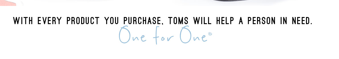
- If you are setting out as brand for the first time – try to factor in a social responsibility element from day one. Ideas: giving a % of profits to a charity, having staff volunteer days, pro bono clients/products, or contributing to a local social enterprise. TOMS shoes’ tagline “one for one” is a great example of a memorable and genuine corporate pledge.
What’s in it for me?
You want to motivate your customers to buy your products and services by using the right language. If a customer isn’t seeing anything that motivates them, they are less likely to convert and engage with your brand. Think about what they really want from this transaction. Are they maybe looking for a better lifestyle? More choices? More flexibility?
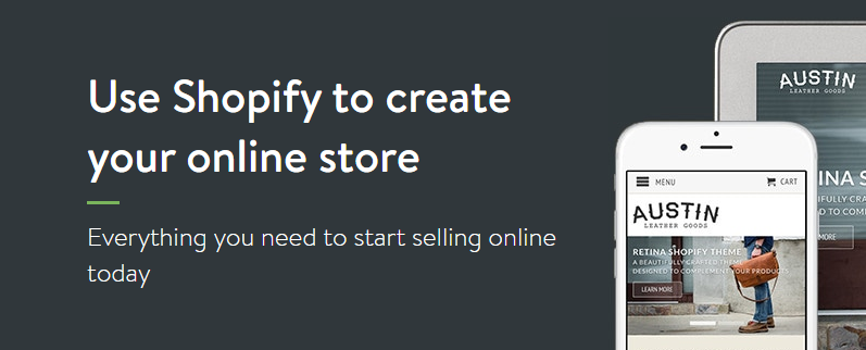
Picture from Shopify
Language like “make it your own” and “make your first sale today” on Shopify’s online store builder page are all about giving the customer ownership about their commercial choices.
Ecommerce brands like Shopify know that they have to motivate their customers to start their own businesses and follow their dreams. On their online store landing page they make their main copy heading and call to actions all about the customer – addressing future store owners about their online store. By cleverly using syntax like ‘your’, they make their brand integral to the customer’s journey as an ecommerce entrepreneur.
On your own landing pages, think about how you use personal pronouns and whether your copy is motivating people to take action. It’s very easy to get caught up in talking about your own brand – but you need to focus on motivating the user instead.
How much is this product/service really worth?
When looking at prices online (or anywhere), people automatically start gauging them against the market.
People are always trying to figure out whether something is worth it– make sure you get your pricing and value propositions right.
- Think about your pricing – too low or too high, and you might be harming your brand and disappointing users. Do you know about the psychology of marketing and the decoy theory? Learn all you can about pricing in order to offer the best possible shopping experience – you might need to have an expensive ‘decoy’ price to make your preferred purchase seem reasonable!
- Users can always navigate away to a competitor and price compare so you have to be transparent. Customers may still come back to you even if you’re not the cheapest, if they think that your brand delivers in other ways. Focus on bigging up any ancillary services to clinch the deal.
- Put your best foot forwards with great product descriptions and awesome product photography. Selling services? You are going to need some great testimonials from customers in order to build trust. Have testimonials with real photos and real user language – don’t make them sound like they were written by your marketing team.
- People like to have options, but give them too many and they may get paralyzed (the paradox of choice). If you have loads of different product features like colors, sizes etc – try to offer these in a subtle way, rather than overloading the user with all the choices at once. Colour swatches and filters are a good way to get around this.
- Make sure that you routinely revisit your value propositions – have they drifted away from your core offering? Can they be made a bit clearer and simplified?
If you’re selling a service, having three separate service levels/subscriptions is a nice way to get people to choose what they think they need. You can shift pricing based on the size of the organization or the level of service or support needed.
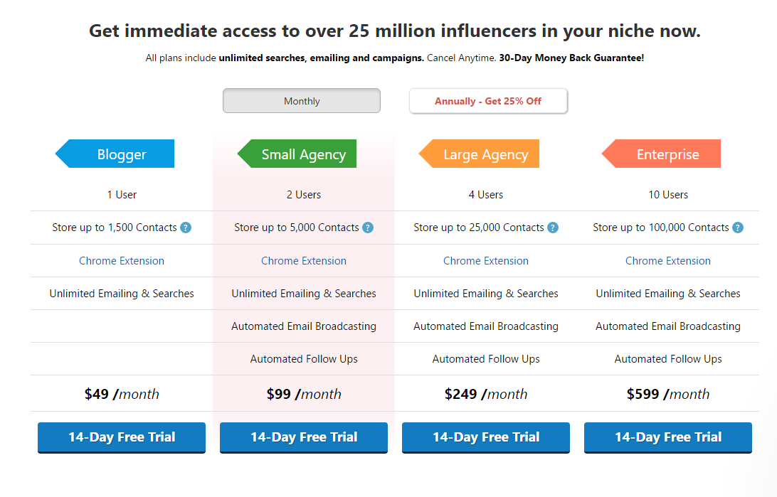
Picture from Ninjaoutreach
Ninja Outreach prove that sometimes the best rules are meant to be broken – they actually offer four different service levels on their pricing page. Using a simple traffic lights system, they make the pricing and call to action buttons super clear.
This pricing page is all about transparency and clarity – great ways to offer value without any fancy bells and whistles.
To add some color and brand personality, at the top of the page they include this super excited quote from one of their users – the use of exclamation marks, idiosyncratic spelling, and lack of correct punctuation make this recommendation sound like Keith is just telling a friend about the service. It sounds genuine and believable – and it’s funny too!
Takeaways
- Pricing should be clear – keep your language simple and highlight amounts and calls to action.
- Traffic light systems or color coding is a great way to visually separate pricing.
- If you include customer quotes – make them sound genuine. Don’t edit them to be ‘perfect’.
What happens if something goes wrong?
Users aren’t always anxious about things going wrong, but they like to know how you’ll react if they do. It’s important to be transparent and open with your terms & conditions, delivery & returns policies, and any other conditions of use.
- It’s become quite common to use terms & conditions generators online– these pages and documents have become quite generic. Make sure that you have some user-friendly explanations of your policies somewhere. Think about how your format these – often a Q&A format is easy to digest and understand, and infographics and icons can help more visual learners.
- Use plain English and reassure users that you aren’t going to scam them. Guarantees and payment protection is always appreciated – though money back guarantees have started to look a little spammy due to overuse.
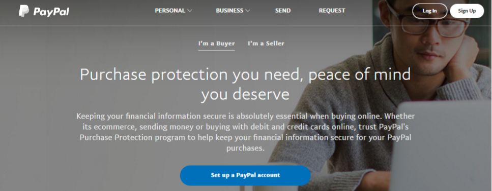
PayPal sells its buyer and seller protection as “peace of mind you deserve” – keeping the benefit focused on the user. It’s not about “look at this great thing we did for you”; it’s about “here’s something you deserve”.
Implement the same user-focused strategy on your website.Even when being transparent about your company actions, the focus should very much remain on users – not you.
Summing up
When thinking about your users, don’t just imagine them as faceless pool – see them as people like yourself. Your sister, your mom, your friend. Imagine how they would want to be treated online, and what wording and messaging would resonate with them.
Usability isn’t always simple; neither is UX design – but listening to your users starts with the small steps that you take towards them. Which user-oriented websites do you think deserves the most praise?