


Last year more people than ever shopped online over the holidays.
In numbers according to the latest study, this means that nearly half (47%) of consumers shopped online this season, 33 percent of them from mobile devices. Online shopping therefore increased by 18 percent compared to 2015.
Knowing this numbers now – it’s really vital for your business that your customers are able to use your eCommerce site without struggles.
So how do you find out if this is the case and? By observing people using your ecommerce site for the very first time.
Here are 2 user tests you should really run on an ongoing basis:
Test your checkout process
Optimizing your checkout process should always be your top priority. Spending some time fine tuning your checkout process and it’s user experience will reward you with happier customers and more sales, so it’s more than worth your time!
According to a study over 66% of people will not finish their purchase although they have already put a product in their shopping card.
Here are the top 14 reasons people are abandoning their card:
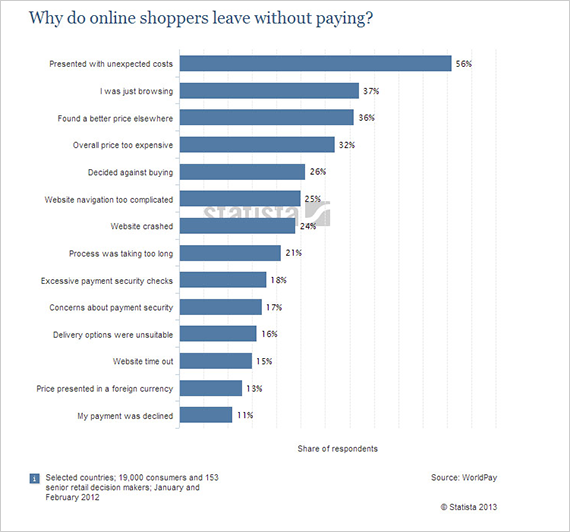
So let’s sum up the things you can improve with user testing:
- Unexpected costs
- Complicated navigation
- Process taking too long
- Concerns about payment security
- Website speed
How to test and improve your checkout process
Testing your checkout process is one of the most simple things you can do. Just let a real first time user search for a product, state the costs and let him/her continue with the order process.
Here is a sample task you can use to test your own site:
Please imagine, that you’ve decided to buy a new [YOUR PRODUCT-CATEGORY].

Tasks

1. Try to find the product you’re looking for without using Search.
2. Have you found [YOUR PRODUCT] on this site? Was it easy to find?
3. You’d like to order [YOUR PRODUCT]. How much do you have to pay?
4. Please try to order this product and continue with the order process. You’ve finished this test, if you reach the final „Place order“ Button. Please don’t click this button, just finish the test here.

Questions
What could be improved on this page?
Would you trust this site if you had to order for real?
This scenario covers all the common pain points for mentioned before. You’ll learn how easy people can find and order products on your site, you can observe how fast your checkout process and site is loading on the participant’s devices and you’ll learn a lot about how the information on your site is perceived from first time users.
Brayola does a great job in their check out experience:
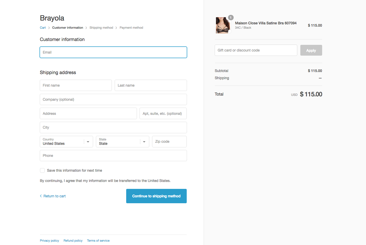
Brayola provides a clear and simple design, removing any distracting elements from the page, clearly showing total costs including shipping and a big prominent call-to-action button to proceed.
Testing your checkout process with real people not only helps you catching usability issues early on but also helps you finding out if it’s working for all your customers.
I’ve done hundreds of usability tests for our clients and stumbled over many sites with broken checkout processes – not for all customers but for a couple of people using a special function or a special device. Very hard to spot without actually observing real people using your site.
This definitely is a thing you won’t like to happen on your site. Continuously user testing your checkout process helps you spotting such problems early on.
I suggest running at least one user test of your checkout process every week. This should’t take more than 20 minutes of your time if you’re running the tests remotely.
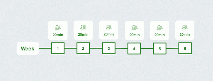
This weekly exposure to user feedback offers a few benefits:
- You can spot problems much faster and therefore move quicker through the design and development circles.
- Instead of waiting 5 weeks for new results to get in, you’ll have new user feedback every week.
- It’s much easier to convince people to free up just 20min than 2 hours at a stretch.
- Watching usability tests every week can easily allow team members to get into the habit of doing so and builds up a shared understanding of your users’ behavior.
I know, that finding participants and scheduling test sessions takes time. But if you’re using a remote usability service like Userbrain, you can save yourself a lot hassle by having tests continuously delivered to your email every week without the need to handle daunting tasks like recruiting participants on your own:
This is how your test setup could look like in Userbrain:
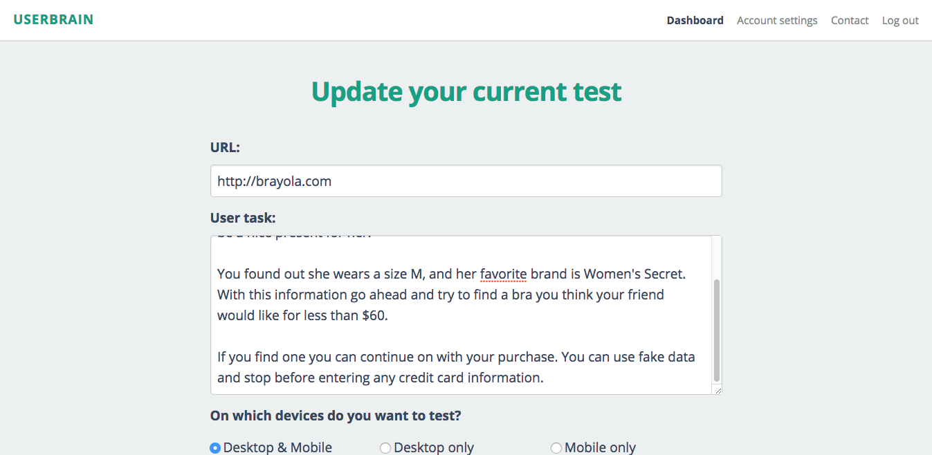
This test delivers a weekly screen and audio recording of someone using your checkout process on either a desktop or a mobile device.
The important part here is to really keep the testing going to make sure you’re spotting problems and areas of confusion in your checkout process early on.
Bonus
You can add these questions at the end of your tasks to learn even more about your checkout process:
How would you describe your overall shopping experience?
Was the final cost what you expected it to be? Why or why not?
Did you feel secure entering your payment information?
At any time did the website crash or timeout?
Test your navigation
Over 25% of online shoppers leave without paying because they can’t find what they’re looking for. Imagine yourself having to cook in another kitchen. Looking for ingredients suddenly becomes a hassle and very frustrating.
This is the experience your customers have, when having to find an item on your site without a clear understanding how you structured your products.
Google has a great video of this experience:
Don’t expect that you can get over a navigation because your customers will use your search function.
According to a recent study only beetween 11% and 21% of users will start with search.
Across these independent data points collected over the last seven years, it seems safe to conclude that most users tend to start browsing over searching.
This means that that the wording of all your navigation items should be crystal clear and easily understandable for your customers.
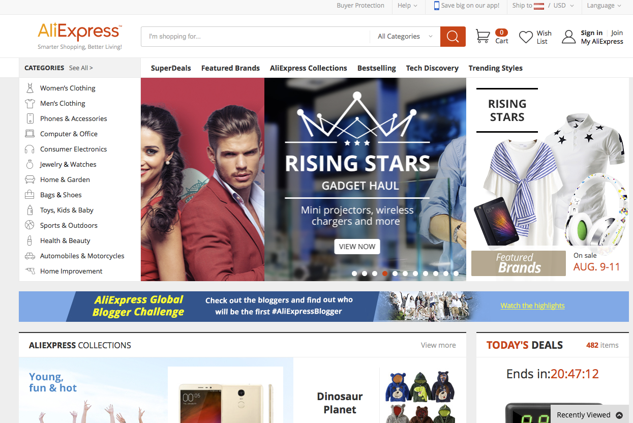
AliExpress offers a very clear navigation despite having to cover lots of different product categories.
How you can test your navigation: One of the best ways to test out your site categorization is to sit someone down in front of your site and ask them to find a specific item without using internal search. This is simple, fast, powerful, and often very painful to watch.
This is a task you can use:
[Show an image of a product which can be ordered on your site. Don’t display the name of the product]

You want to find a product similar to this one. Go on and find a similar product on the site. Please don’t use search.

Another approach is to ask the participant to read through the Top Level Navigation on your site and explain which items they would expect there – without clicking anything. He’ll later the way you’re structuring and sorting matches the mental model of your participant.

This is a task you could use:

Read through the navigation of this site. Please don’t click on anything yet. Which things would you expect to see when clicking the titles?

Now click on the first element in the navigation bar. Would you have expected the elements shown? Why or why not?
Using this kind of task you’ll learn if the category names accurately convey content.
Improve your navigation with card sorting
So you’ve spotted problems of the wording of your navigation elements during user tests. But how should you improve your category names, how should you call them?
You can easily and quickly find out how people think your content should be called and organized using card sorting.
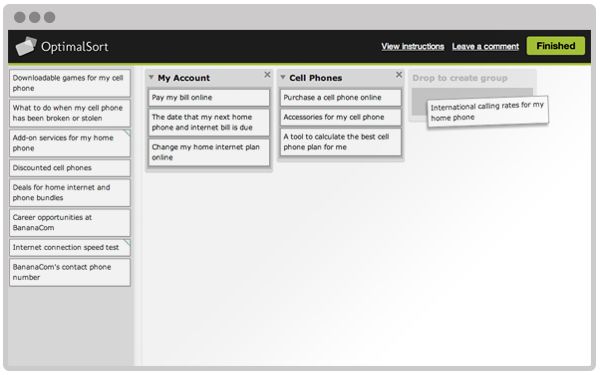
With online card sorting tools like OptimalSort you let participants group and label your content elements for you. This provides very valuable insights into the head of your users.
Here are some questions card sorting can answer:
- Do the users want to see the information grouped by subject, process, business group, or information type?
- How many potential main categories are there? (typically relates to navigation)
- What should those groups be called?
Then, once you think you have everything organized nicely, you can test this version of your site again in user tests to make sure you haven’t created any new areas of confusion.
Summing up
Your checkout process and navigation are the most important elements on your site being very prone to errors and ambiguity.
So you should really make sure to find and fix problems in this areas fast and comprehensively. User testing allows you to spot these problems early on and fix them before the run havoc on your potential customers.
Run these 2 tests at least twice a month and you’ll sleep better. Promised.
